

Dominate Local Search with Proven New Orleans SEO Solutions
Search engine optimization (SEO) is the key to helping your New Orleans business stand out online. When potential customers search on Google, Bing, or Yahoo, our proven SEO strategies ensure your business appears at the top of local search results. By optimizing both on-site and off-site factors, we help drive more traffic, leads, and revenue for your organization.
Our dedicated New Orleans SEO experts craft tailored strategies, including high-quality content marketing, authoritative link building, and enhanced user experience, to ensure long-term success. Let us take your business to new heights with results-driven SEO solutions designed to get your website ranking, engaging, and converting.

Our Search & Content Team Hustling Hard for Our Clients
How Online Optimism Drives Success for Local Businesses


Sustainable SEO Strategies That Drive Results
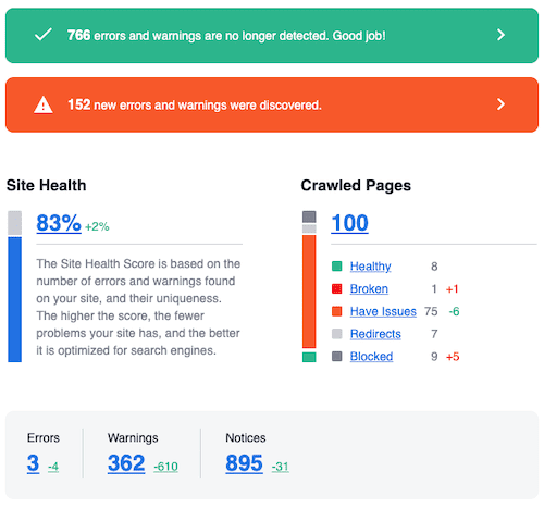
SEO is constantly evolving, and we stay ahead by taking a data-driven, holistic approach. Through pre-campaign analysis, intelligent website updates, and strategic link building, we ensure long-term success for your business. With ongoing monitoring, we make it easy for search engines to find—and rank—your company.
What are our clients saying about our New Orleans SEO work?
Partnering with Online Optimism has been a game-changer for us. Their SEO and PPC expertise have given us incredible results.

We were thrilled with the exceptional work done by Online Optimism. Their expertise in SEO has significantly boosted our online presence, attracting more traffic and inquiries. The process was smooth, and their team was incredibly responsive and professional.

Our goal was to ensure users searching for cryptocurrency ATMs in their area could find us immediately and have access to the information they needed—Online Optimism helped us rank higher organically and in paid auctions, increasing our brand awareness in the process.

When we launched Mid City TMS, Online Optimism became an invaluable partner, helping us grow our online presence and attract patients. Their SEO and content strategy drove measurable results, and we’re thrilled with the outcome.

Online Optimism’s team provided our staff with important guidelines to better incorporate SEO into our current content strategy. By providing us with instructions to follow going forward and assistance setting up easy-to-read reports, Online Optimism has helped us take our digital marketing efforts to the next level.

Interested in Looking at Real Results?
"*" indicates required fields
Exploring Local SEO
SEO is a strategic approach to boosting your website’s visibility on search engines, thereby increasing site traffic. Collaborating with Online Optimism, a premier New Orleans SEO agency, offers you the advantage of bespoke strategies designed to significantly enhance your digital footprint and brand recognition.
New Orleans SEO Essentials
Our New Orleans SEO strategy is crafted to connect directly with the local community. We go beyond more generic SEO techniques by focusing on elements crucial for localization.
Targeting New Orleans Keywords
Our approach begins with identifying and incorporating New Orleans-specific keywords into our SEO strategy. This ensures that your content aligns with what searches are being made in the area, as well as addressing residential pain points, tourist questions, and business partnership opportunities.
Local Content Creation
We prioritize writing content that is engaging and resonates with the New Orleans audience. From cultural events, to local news, and hidden gems, our content reflects the city, making it appealing to the local community and visitors.
Building Local Backlinks
Building connections with other local businesses is crucial. By working to secure backlinks from these sources, we can improve its overall authority—especially in New Orleans—making it more visible and trusted.
Distributing NAPW Information
Name, address, phone number, and website distribution is another part of our New Orleans SEO strategy. We ensure your business’s information is accurately listed across directories and other platforms, making it easier for people in the area to find you.
Utilizing Schema Markup for Local SEO
Implementing schema markup helps search engines understand where your business is located and what services it offers, which will boost your visibility.
Optimizing Google Business Profiles
Well-managed Google Business Profiles are indispensable for local SEO. We focus on ensuring your GBP is optimized by ensuring it has local keywords, keeping the updates recent, responding to reviews, adding images, and more.
On-Page SEO & Technical Audits
Effective on-page strategies and technical audits are essential to New Orleans SEO success. We optimize your website’s titles, internal linking, image alt-text, and more, utilizing schema markup for clearer search engine understanding.
If you’re looking for a New Orleans SEO company for your business, you’ve come to the right place. Our expertise allows us to create hyper-local New Orleans SEO campaigns for businesses. Our professionally-minded team here at Online Optimism creates a customer-centric, tailored SEO campaign that increases your conversion rates and improves search engine rankings.
Talk New Orleans SEO with Us, In Person!
Location Information For Our New Orleans Digital Marketing Agency Location
- Free parking available, on a first come, first served basis
- Dog-friendly office
- Wheelchair-accessible parking lot
- Gender-neutral restroom
Our building is located on Soraparu Street, between its intersection with St. Thomas Street and its intersection with Rousseau Street, but we recommend you actually to turn into the parking lot from Philip Street. Find us on that side of the building, through the big, green door.
See our Latest Content Marketing Blog Posts


Learn more about our different New Orleans SEO tactics below