
Are you brainstorming branding and logo ideas for your New Orleans business but still stuck deciding whether to use a fleur-de-lis in your logo? We designed a fun selection of New Orleans business branding concepts to inspire your new brand. Take a look at the examples spanning several industries below.
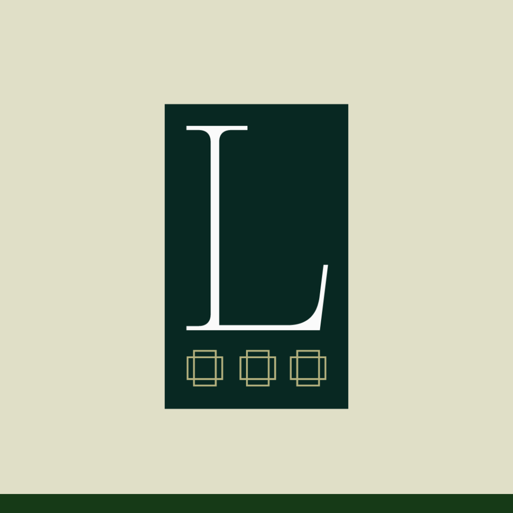
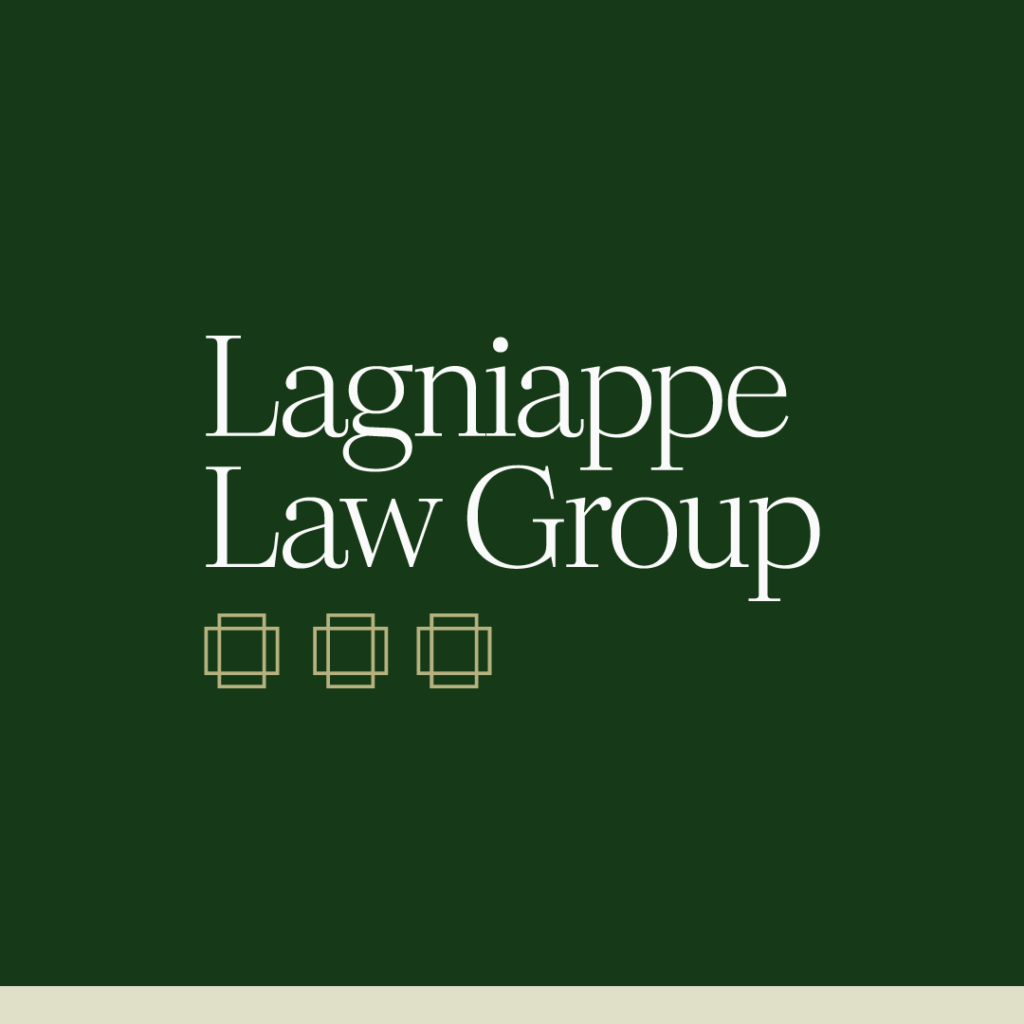
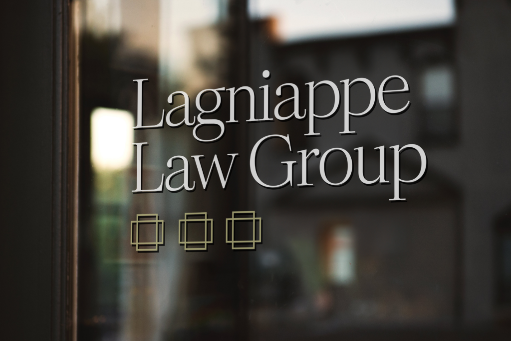
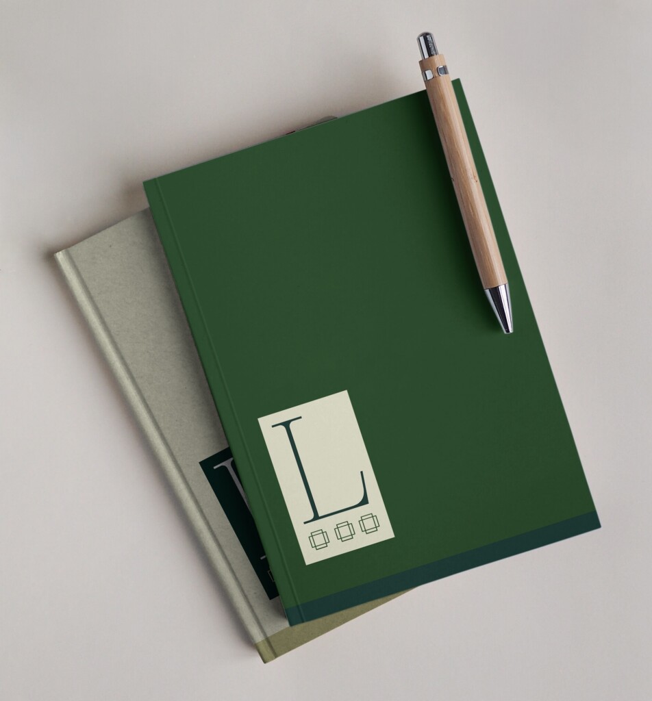
Lagniappe Law Group
Industry: Law Firm
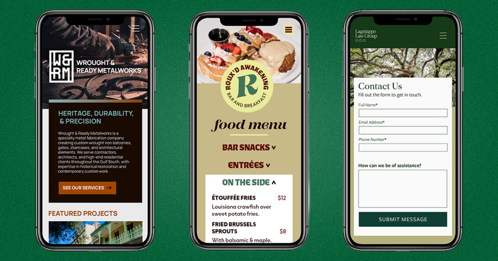
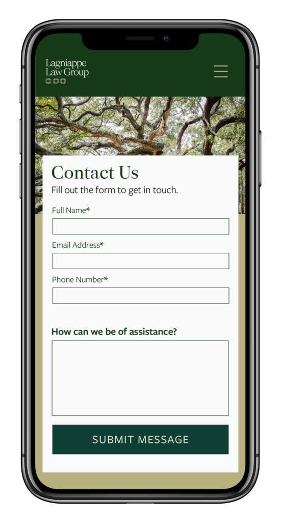
The Art Deco–style icons in Lagniappe Law Group’s logo marks reference architecture, stacks of documents, and an ellipsis… hinting at a little something extra. For the typography, we used a serif font (Palast Var) in the logo and headings to convey experience and trustworthiness, paired with a sans-serif body font (Freight Sans) for readability and accessibility. A combination of multiple deep greens with gold feels rooted in New Orleans and is a palette that is traditional while still standing apart from more common law firm palettes of reds and blues.

Roux’d Awakening
Industry: Restaurant/Bar
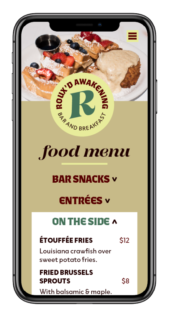
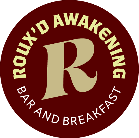
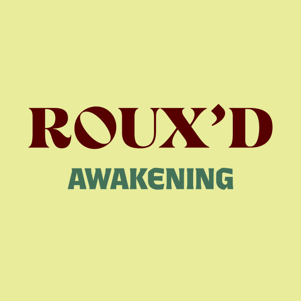
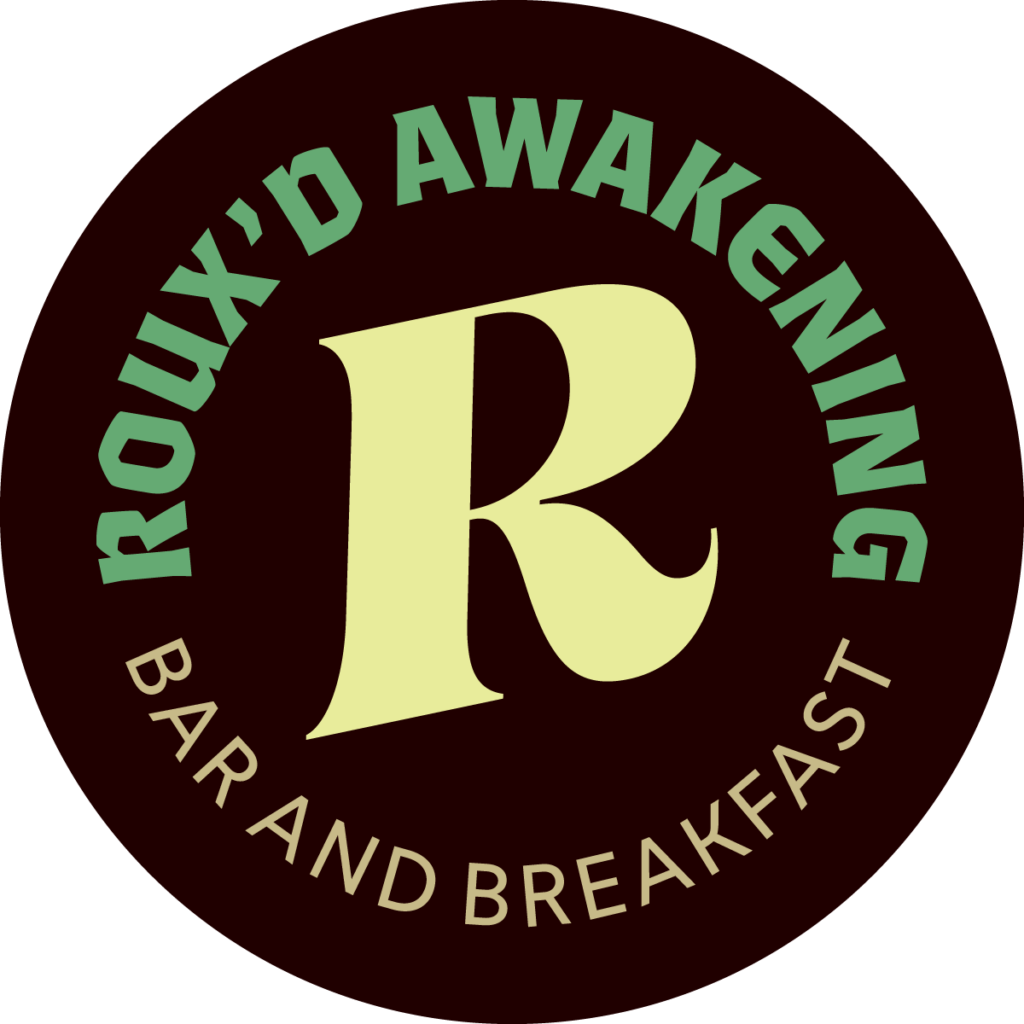
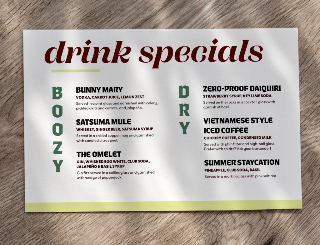
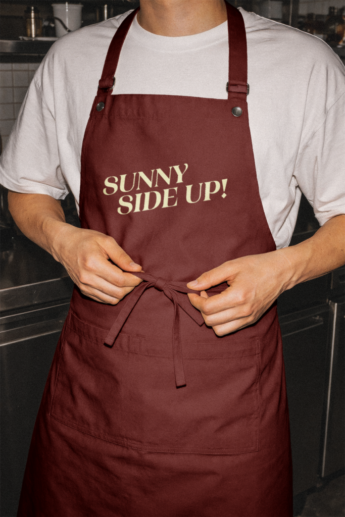
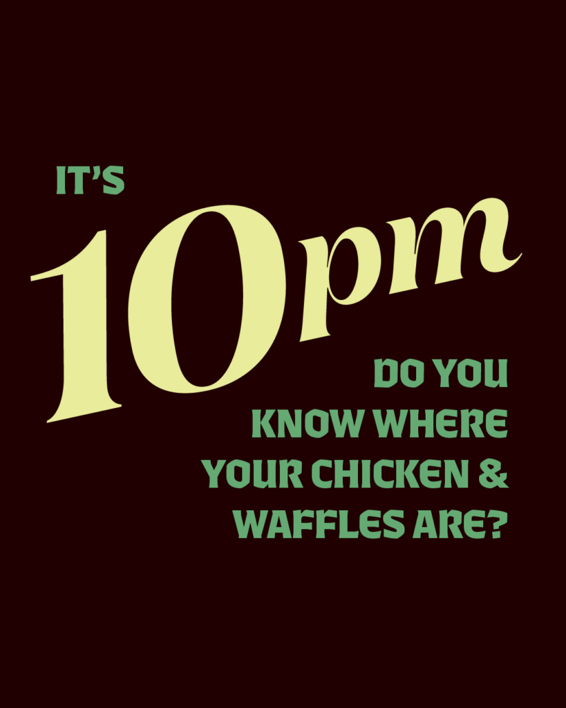
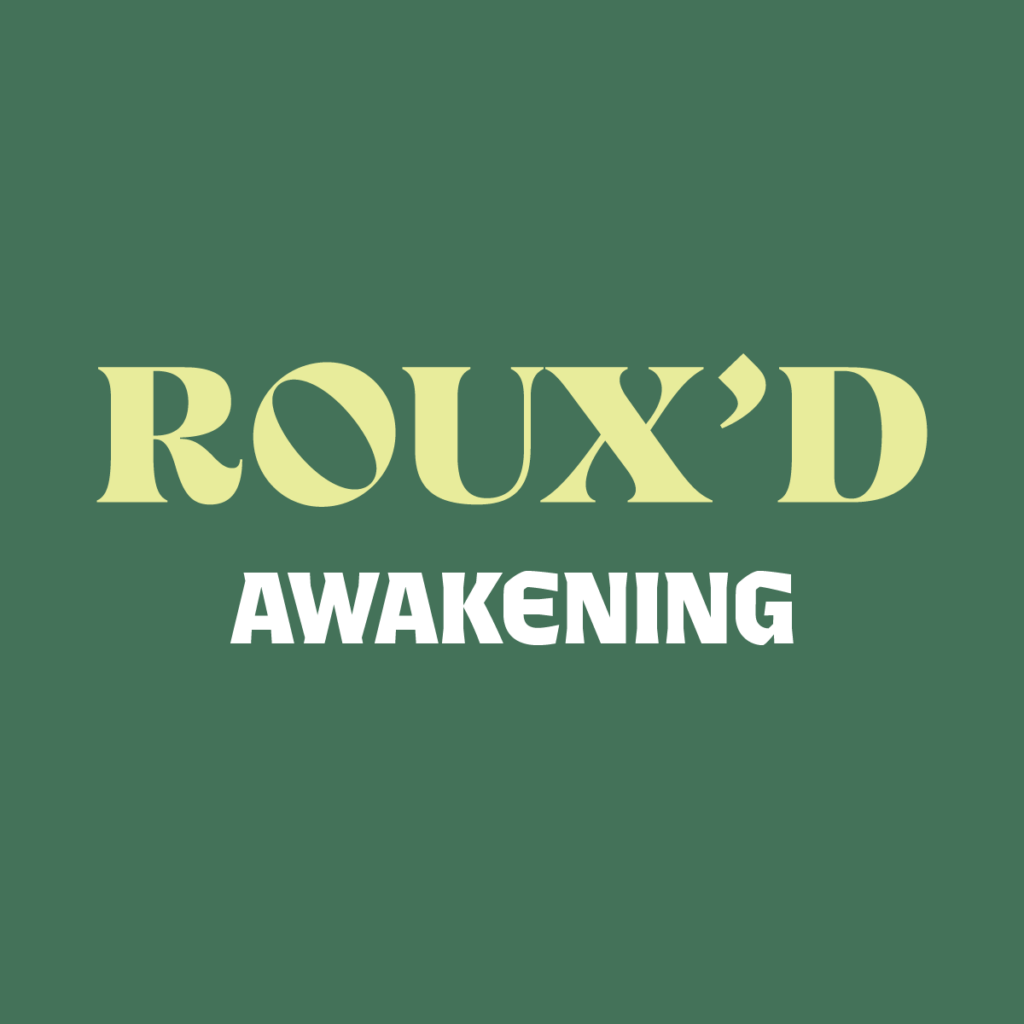
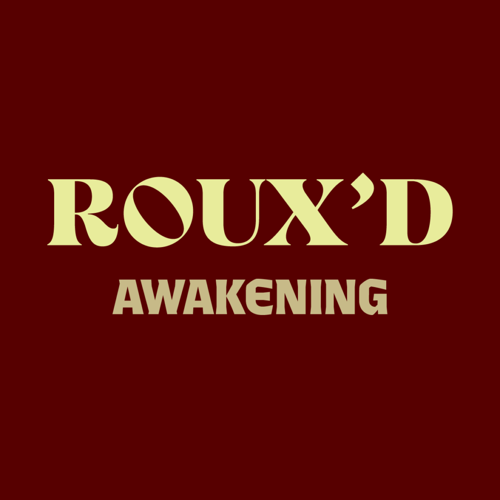
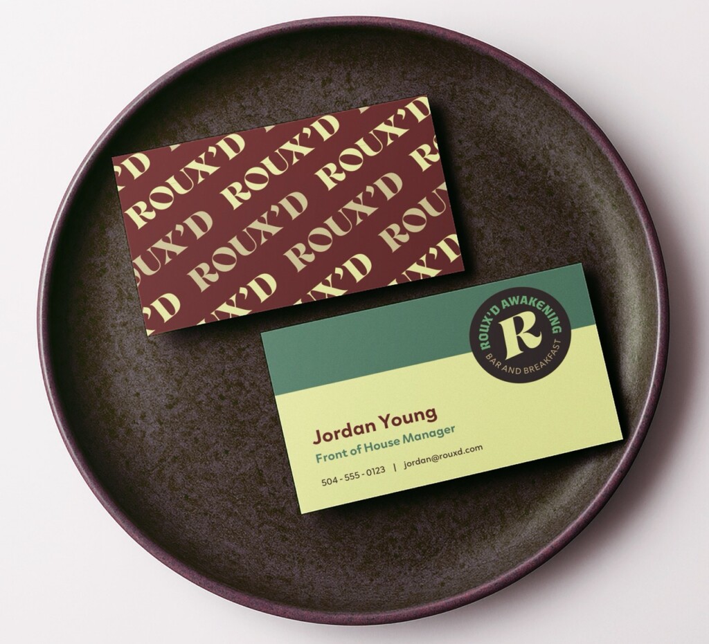
An eclectic potluck of typography is the bread and butter of Roux’d Awakening’s brand, blending an expressive serif (Campaign Serif), a modern blackletter (Ferryman), and a stylish and clean sans-serif (Clother). These typefaces work together to create engaging menus and designs with quippy copy for merchandise and social posts. Okra flowers inspired the brand’s color palette.


Wrought & Ready Metalworks
Industry: Industrial Fabrication and Construction
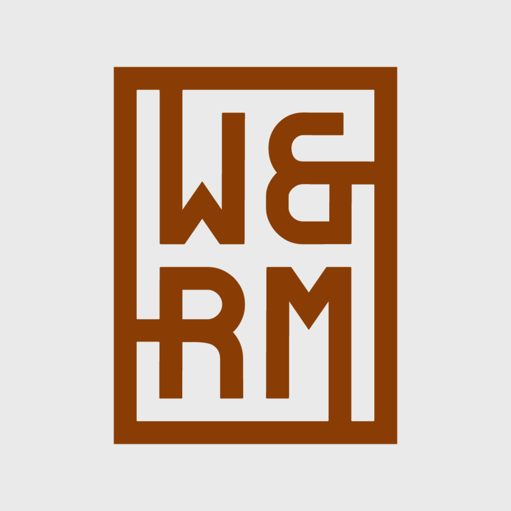
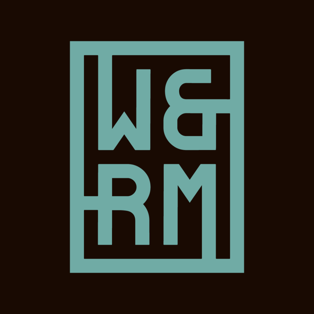
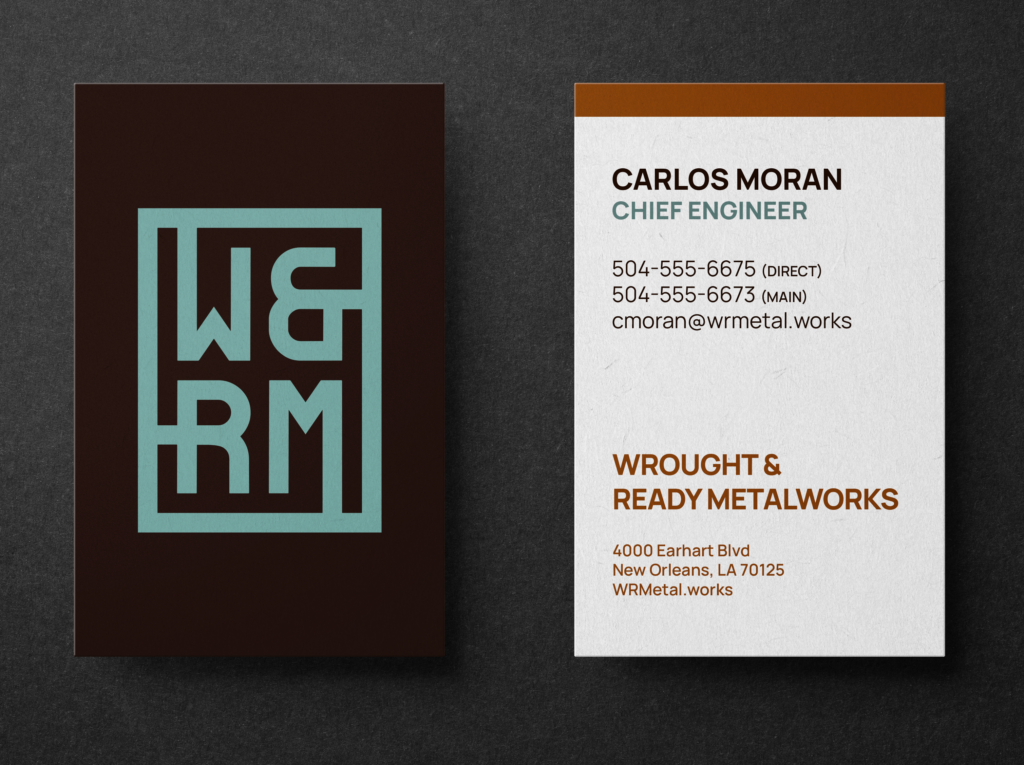
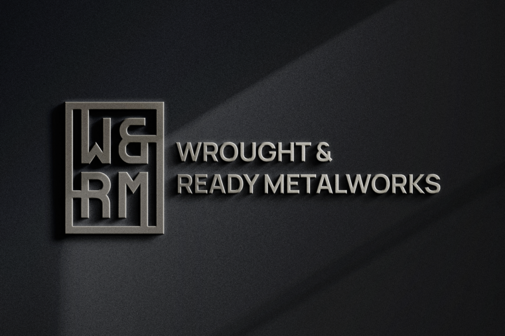
Like quality ironworks, the logo mark for Wrought & Ready Metalworks is designed with aging well in mind. The forms of the letters reference wrought and cast iron, and the overall logo can be cut as a single stenciled piece of metal. Typography for the brand is simple, practical, and uniform: the sans-serif typeface Manrope. The primary brand colors come from cast iron and Corten steel, with an accent of a blue-green patina.



Big Easy Fix
Industry: Family-Owned Home Repair
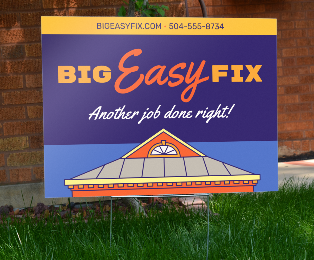
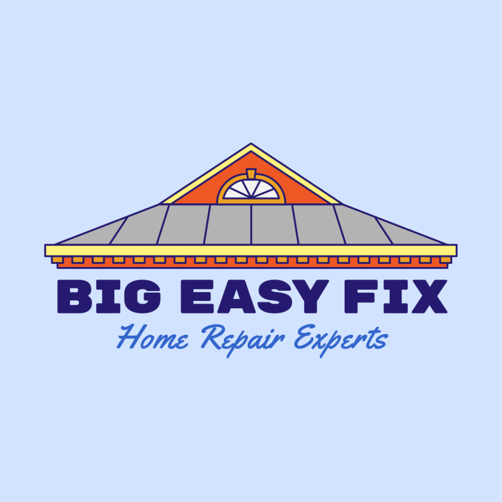
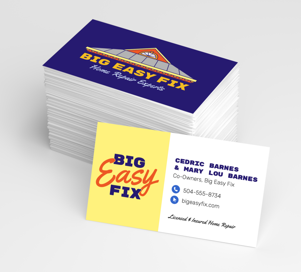
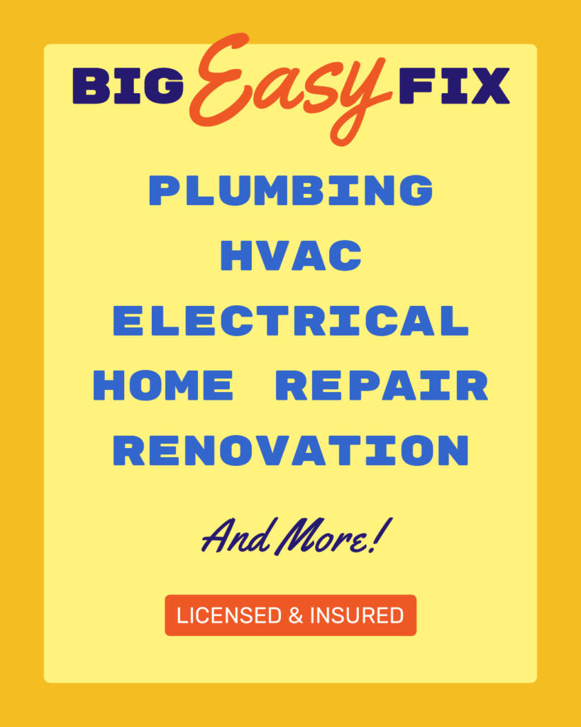
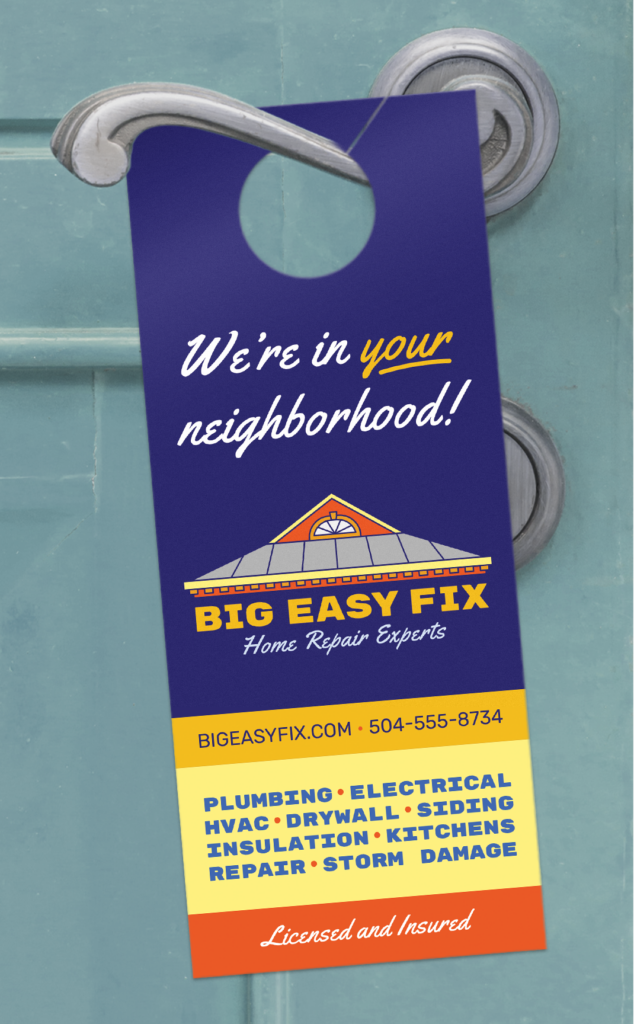
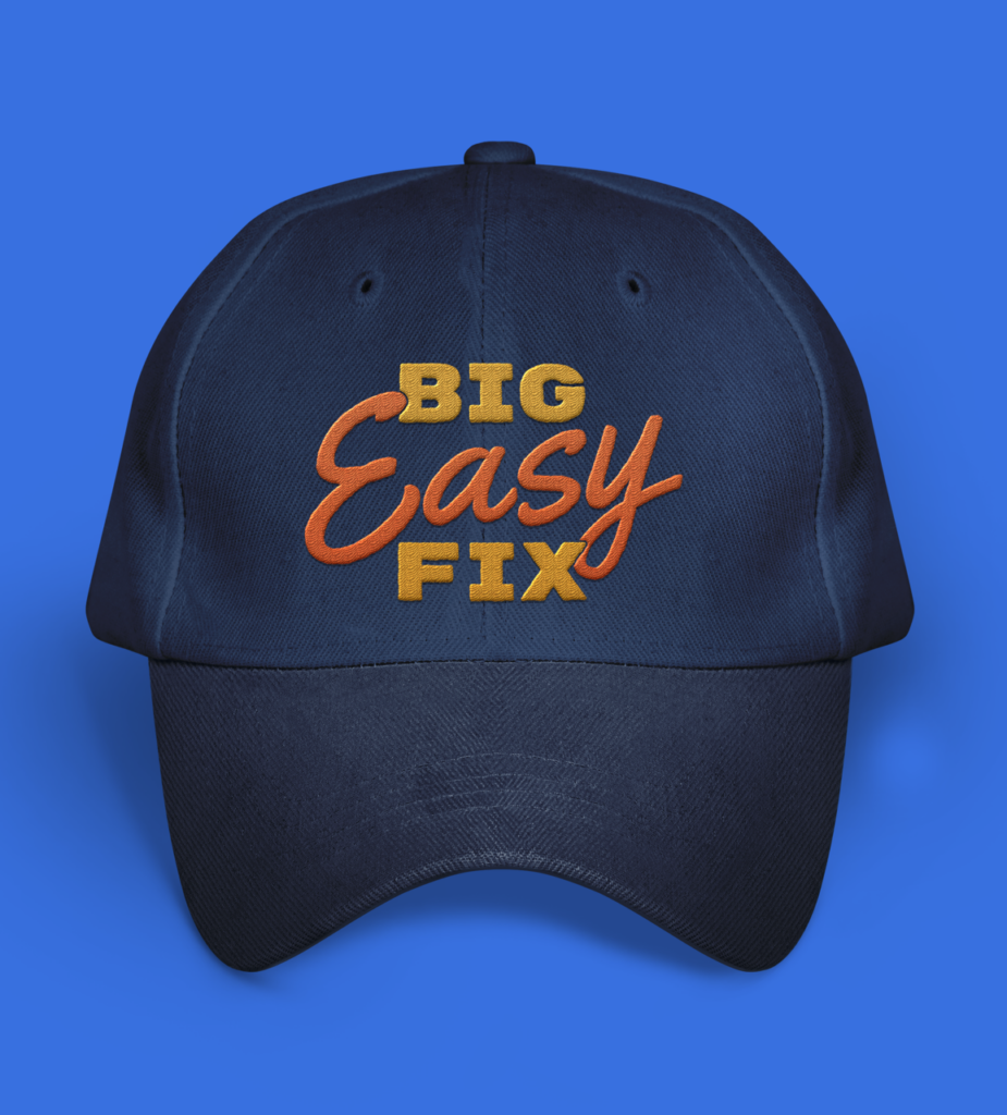
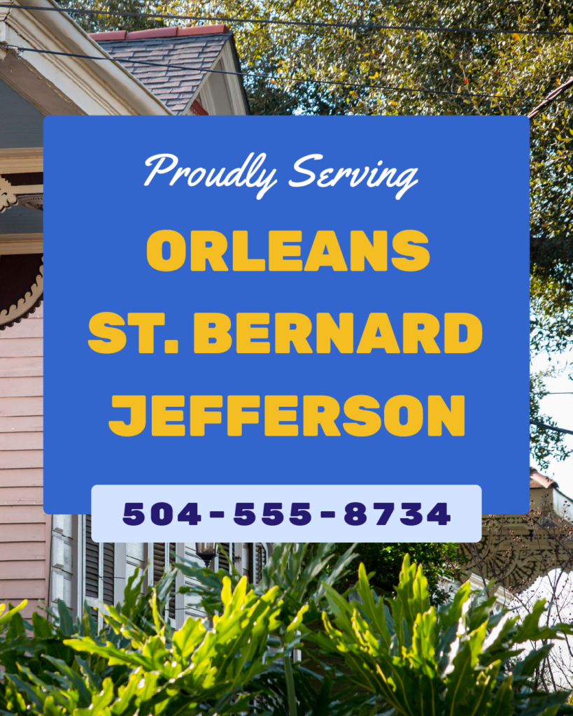
Big Easy Fix’s warm primary palette feels at home in Louisiana’s climate (and references our state flag) while keeping the brand feeling humble and approachable. The brand fonts, Rubik, Rubik Mono, and Yellowtail, are all available free from Google Fonts, making it easy for team members to stay on brand for any quick flyers they might make—without needing professional design software. The logo includes a roofline of a shotgun house with gingerbread trim, referencing New Orleans homes without going over the top.
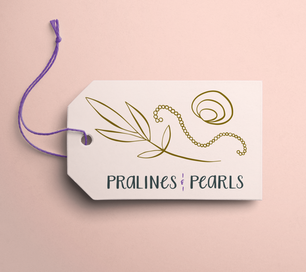
Pralines & Pearls
Industry: Boutique Gift Shop
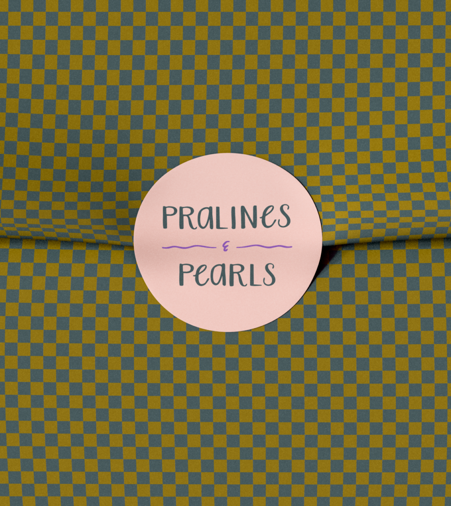
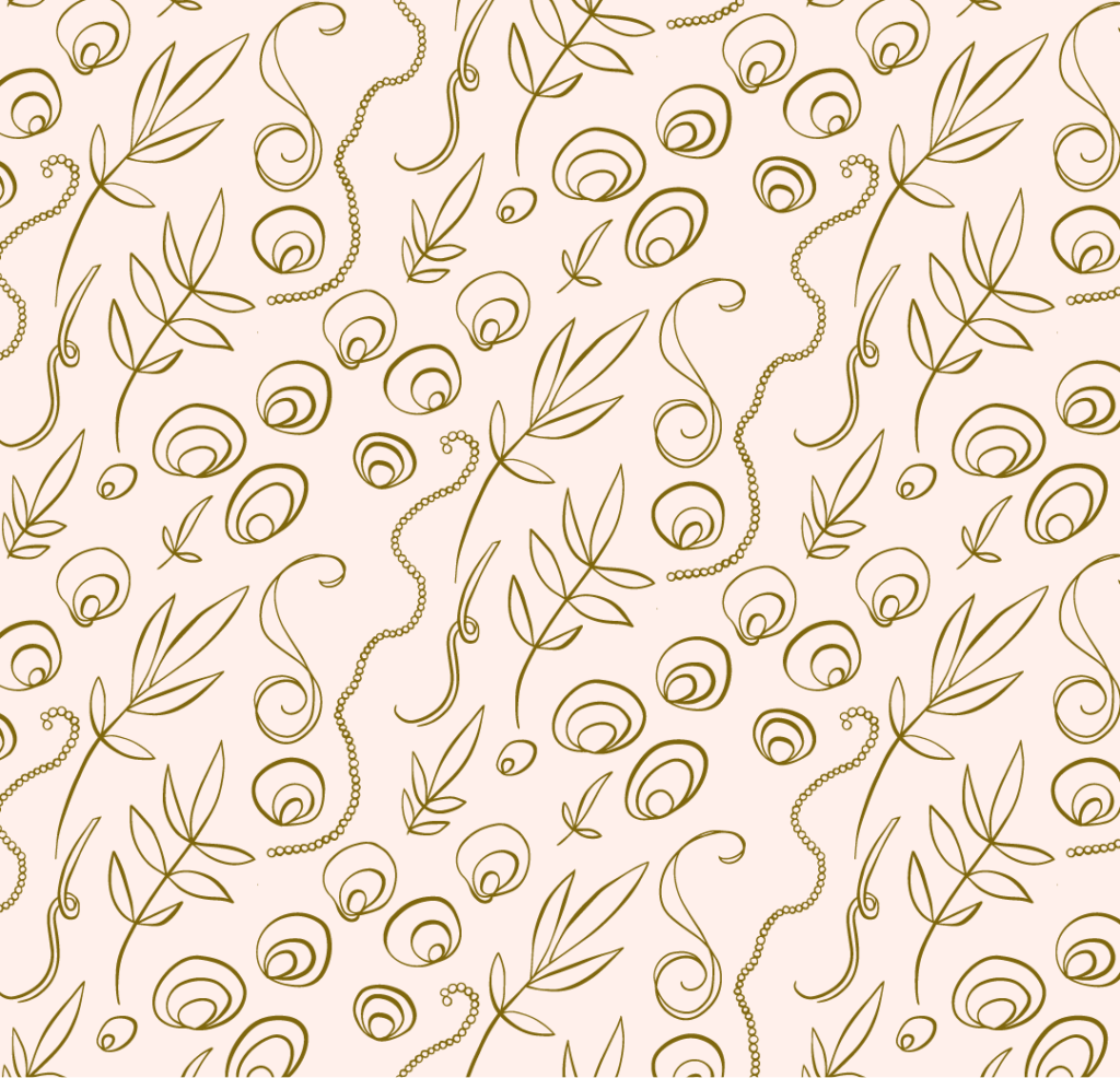
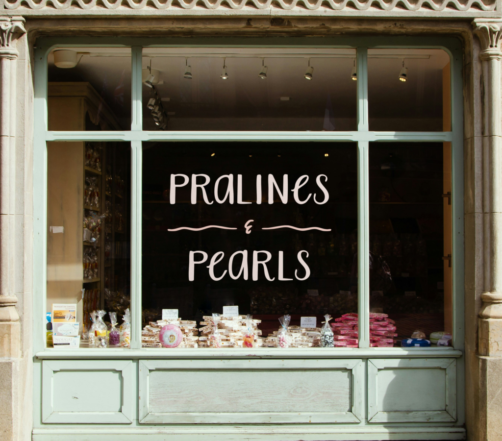
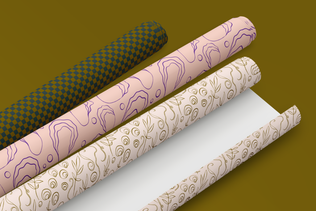
Pralines & Pearls’ palette includes some metallic tones of pewter and caramel, a soft blush in two different tints, and a jolt of jewel-tone color with a violet orchid accent. The wordmark is a combination of a handwriting typeface (Aristelle Sans) with custom hand-drawn glyphs for the A, E, and ampersand. The sans-serif Poppins complements the handwriting font for body copy. Delicate line illustrations of shells, feathers, strings of pearls, ribbons, and pecan branches add personality, and custom patterns round out the brand.

Want more help getting your new brand rolling? Online Optimism can help you with logo design, color palette and typography, a full brand guide, and any collateral you need, such as business cards, letterhead, and social media templates. We can also design and launch your brand’s new website or social media marketing campaign. See our full list of services.